
A design is finished when it ships and moves something, not when it presents well.
Six outcomes from work already live. Every figure links to the case study it came from.
Browsing that gets out of the way
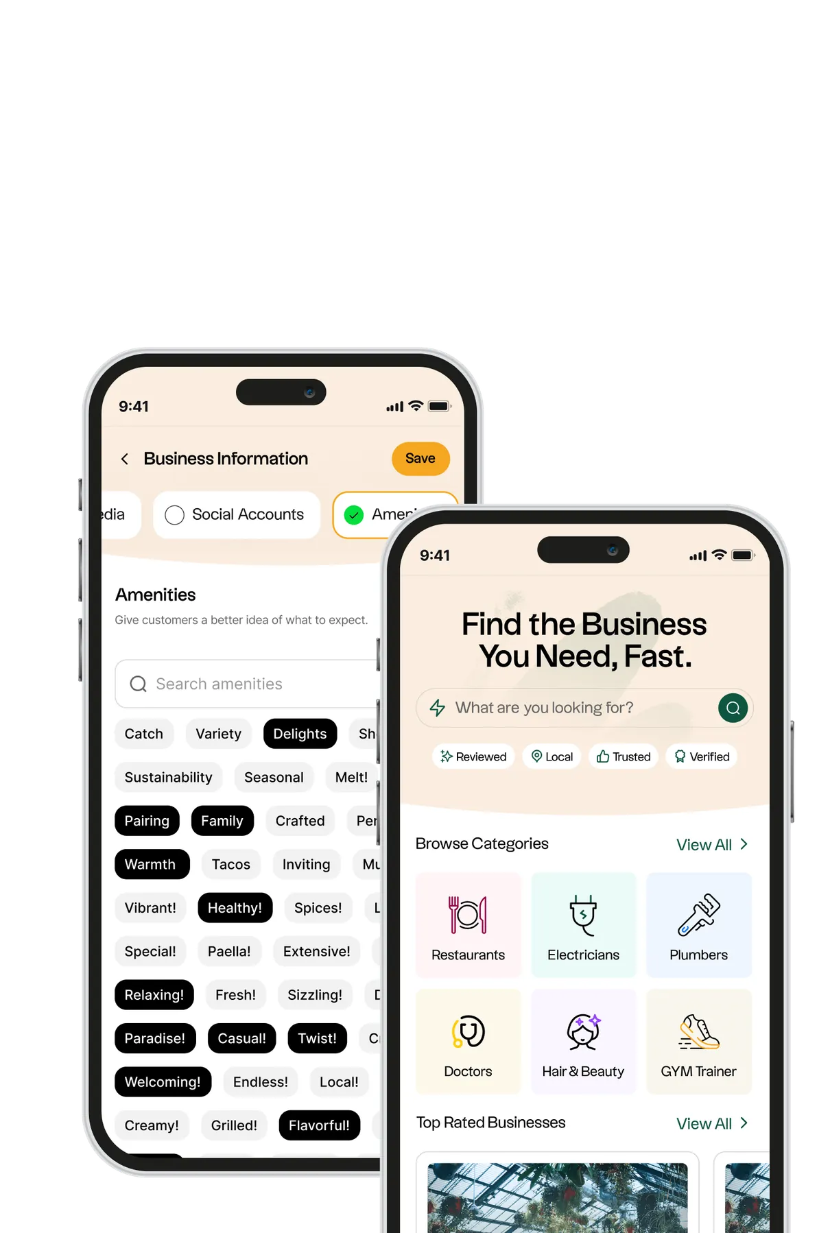
New UX architecture and smarter search, rebuilt around where people were actually dropping off rather than where we assumed they were.
3Xlisting enquiry rateDesign that moves a business number
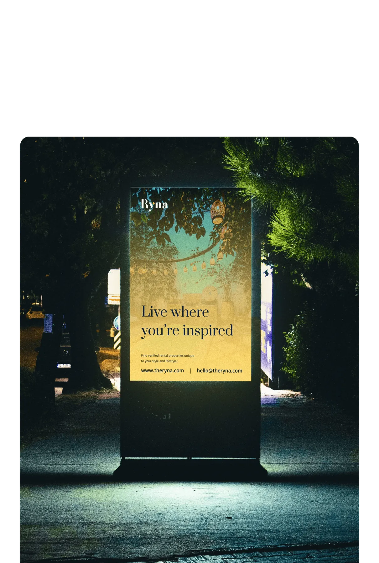
Enquiries are the number that matters on a property portal. The work was aimed at that one metric and reported against it afterwards.
4Xsession completion rateFinishing, not just starting
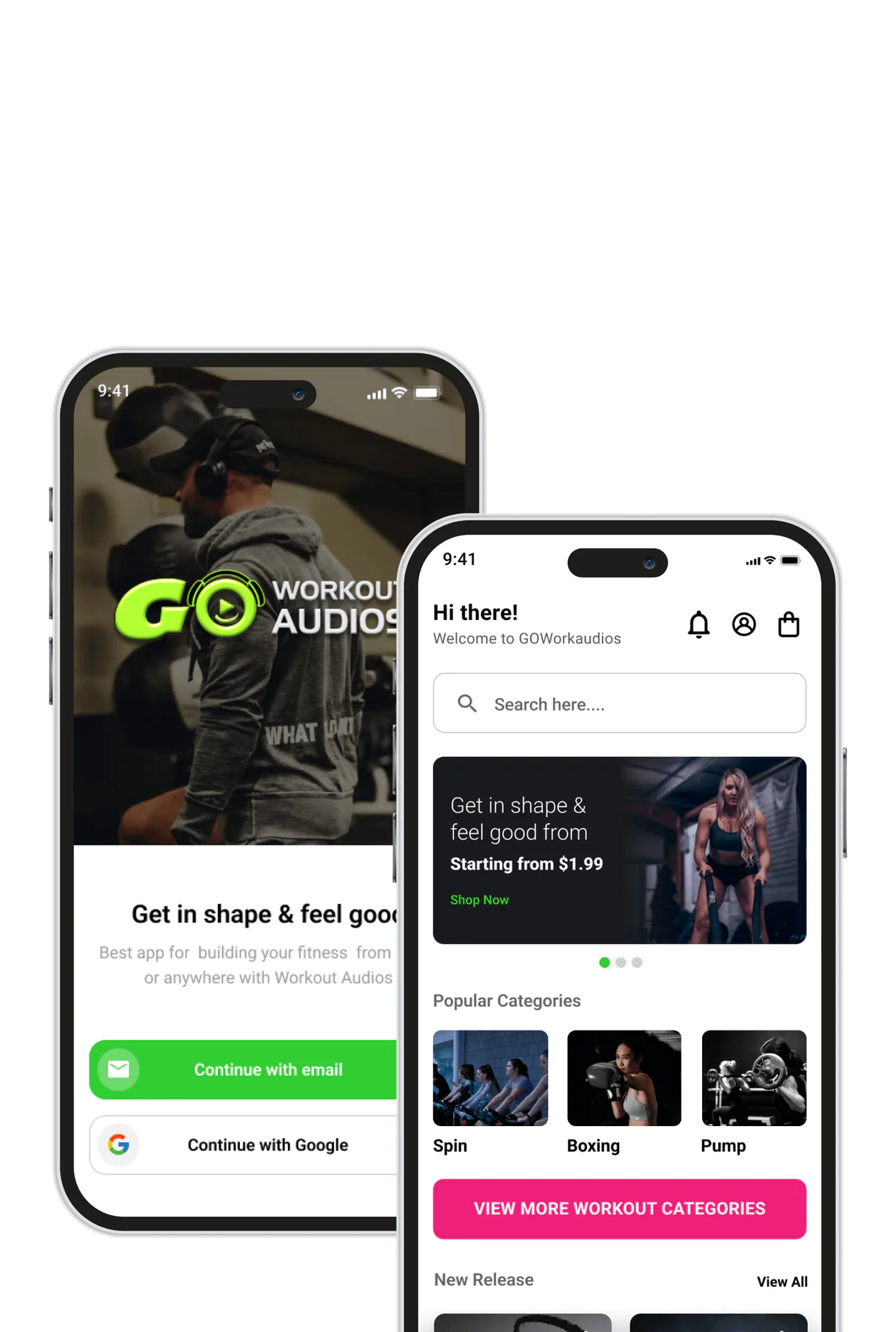
Completion is the only honest measure for an audio product, so the flows were shaped around the end of a session rather than the start.
65%increase in return usersPeople who come back
Retention came out of the unglamorous parts: time to first play, fewer taps, and nothing standing between opening the app and getting value.
5 weeksdiscovery, design system and launchConcept to production
Research, UX architecture, a warm visual system and mobile-first listings, all on a five-week calendar.
100%design and development in-houseOne team, no handoffs
Designers and engineers on the same build. Nothing gets lost in a spec handed over a wall, and nothing waits in a queue.
Five design engagements, and what each one leaves behind.
Product Discovery & UX Architecture
User journeys mapped against real drop-off, then an information architecture that reflects how people actually look for things.
Flows and a sitemapInterface Design
On-brand screens for web and mobile, designed against real content rather than placeholder text that flatters the layout.
Production-ready screensDesign Systems
Reusable components, tokens and states, documented so engineers stop re-deciding the same details on every screen.
A living component libraryPrototyping & Motion
Clickable flows and transitions tested before anyone writes code, which is the cheapest place to be wrong.
A testable prototypeRedesign & Rescue
An audit of what is actually losing users, then a rebuild of the parts that are, on a fixed calendar.
A measured before and afterHow a design engagement runs.
- 01DiscoveryWhat is actually wrong
Existing designs reviewed, your team interviewed, journeys mapped against where drop-off happens. GreenHub started here and it set the whole brief.
- 02ArchitectureHow it should be organised
Information architecture before visual design. Getting this order wrong is how a beautiful redesign ends up performing worse than the thing it replaced.
- 03FlowsThe path through
Every state, including the empty, error and slow ones. Products get used on bad days more often than good ones.
- 04UI systemThe visual language
Type, colour, spacing and components defined as a system, so screen forty looks like screen one without anyone having to police it.
- 05PrototypeProof before code
Clickable and testable while changes are still cheap. An hour here routinely saves a sprint of rework later.
- 06HandoverWhat engineering receives
Components, tokens, states and the reasoning behind them. Our designers sit with our engineers, which is why the built thing matches the file.
Why We Design This Way
Three habits, each one a mistake we would rather not make twice.
We design against the number the business cares about
3X listing enquiry rateGreenHub was aimed at browsing speed, Ryna at enquiry rate, Go Workout Audios at session completion. Naming the metric before the first screen is what makes it possible to say honestly afterwards whether the work succeeded.
Architecture before aesthetics
3X faster browsingThe most common way a redesign fails is that it looks better and performs worse, because the information architecture was inherited without being questioned. We fix the order of things first and make it beautiful second.
The designers sit with the engineers
100% in-house · 5 weeksEverything on this page was designed and built by the same in-house team. There is no spec handed over a wall, which removes the gap between the file and the shipped screen, along with the two weeks usually spent arguing about it.
Frequently Asked Questions.
What does your UI/UX design process look like?
We start with discovery-reviewing existing designs, interviewing your team, and mapping user journeys against where drop-off actually happens. That leads into information architecture, then user flows, then interface design, then a clickable prototype. Every stage is reviewed with you before the next one starts, and the whole engagement is aimed at a business metric agreed at the beginning.
Do you design mobile apps as well as websites?
Yes. We design for web, iOS and Android, and we design each one against the constraints it really has-one-handed use, small screens, and poor connections on mobile. Several projects on this site were designed once and shipped across all three surfaces from a single shared backend.
Can you work from our existing brand and design system?
Yes. We can extend a system you already have, audit and repair one that has drifted, or build a new one from scratch. If you have brand guidelines we design inside them; if the design system itself is the problem, we will tell you and scope the fix separately.
Do you hand over designs, or can you build them too?
Both. We hand over components, tokens, states and documentation if you have your own engineering team. More often we build it as well-our designers and developers are the same in-house team, which is why the shipped screen matches the file rather than approximating it.
Idea in your head? Let’s
bring it to life.
Got a project? A wild idea? Or just want to say hey?
We're here for all of it — reach out anytime.